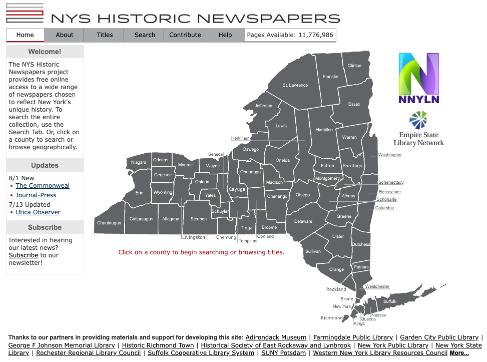
New York State Historic Newspapers launched in Spring 2014. Barack Obama was a year into his second term as President of the United States. Microsoft Windows 8.1 had just been released and Mac OS X Yosemite would come that Fall. It was estimated that only about half of Americans owned a smartphone.
Previously, we had run a regional newspaper website called “Northern New York Historic Newspapers”. It featured a map of the counties of Northern New York and a search box and not much else. In creating the new statewide website we decided we needed a more attractive display. We hired a designer to create a new logo and then used that logo’s colors to base the display. Since we didn’t yet have papers from every county we started “filling in” counties dark if we had at least one paper and light gray if none were available. Within a couple of years we had titles from the whole state producing the home page we know today.

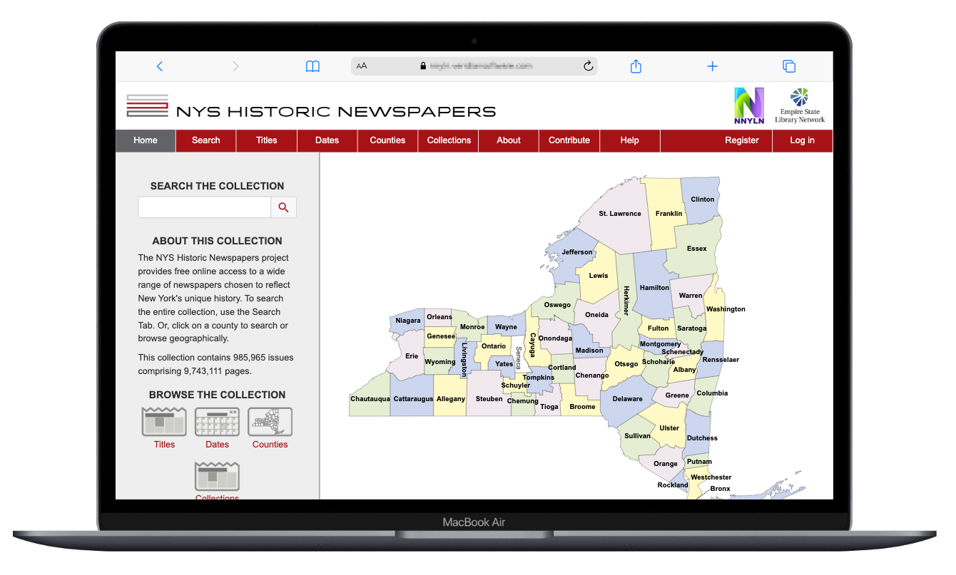
These days we have titles from every county so color coding the counties is less important than it was. When we started working with Veridian (veridiansoftware.com) we wanted to keep our color palette and logo but we asked for something “modern and responsive”. “Modern” is an easy request! Our current site looks like it came from 2014. Pretty much anything Veridian’s designers could do would be an improvement! The “responsive” part was important and much harder.
Back in 2014 most visitors were using desktop or laptop computers. The dimensions of the screens, the colors they could display and pixel resolution then were fairly standardized. If it looked good on our screens it’d look good on anybody’s screens. That’s not true anymore! Visitors now view from laptops, desktops, smartphones and tablets in dozens of sizes and shapes. The site needs to look good and be usable no matter what the visitor is using. Veridian’s designers took our directive and provided just what we were looking for.

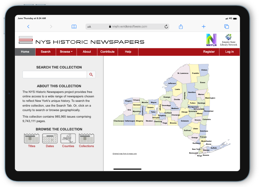
We’re pleased with this outcome! The site retains our color scheme and the alternating colors make it easy to distinguish the counties from each other. But what we’re really excited about is how it looks on different screens. How about on a tablet?

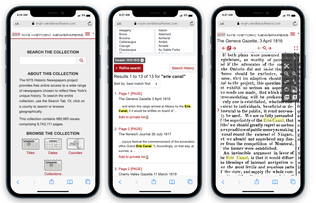
Or on a smartphone screen? This screenshot shows the main page, a search in progress and viewing the result in a newspaper.

The new site has clean modern design combined with full mobile responsiveness. We can’t wait for you to see and use it!
Sure, it’s pretty. But what you really want to know is: how does it search? Next time we’ll talk about it’s new searching features!
